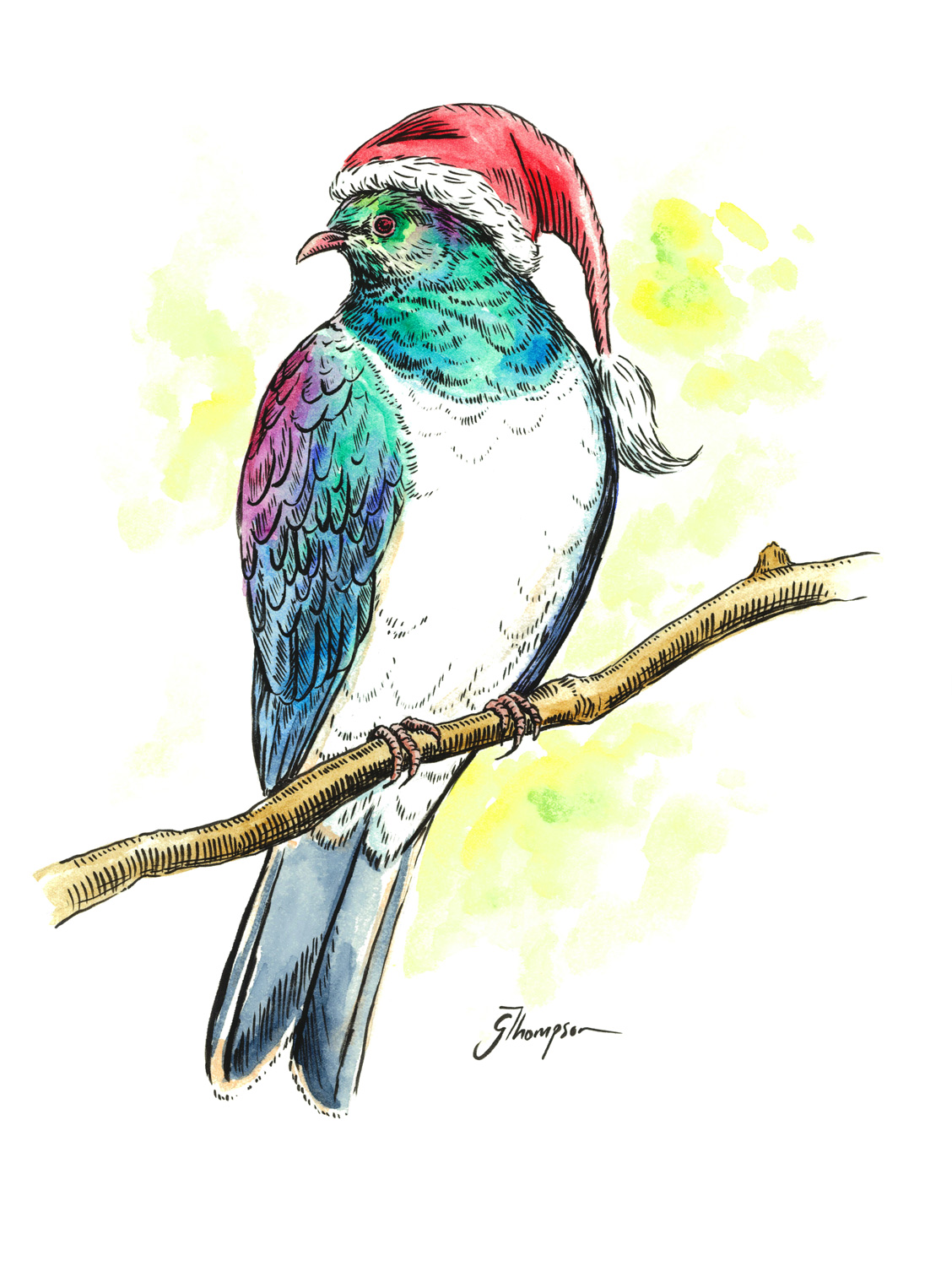
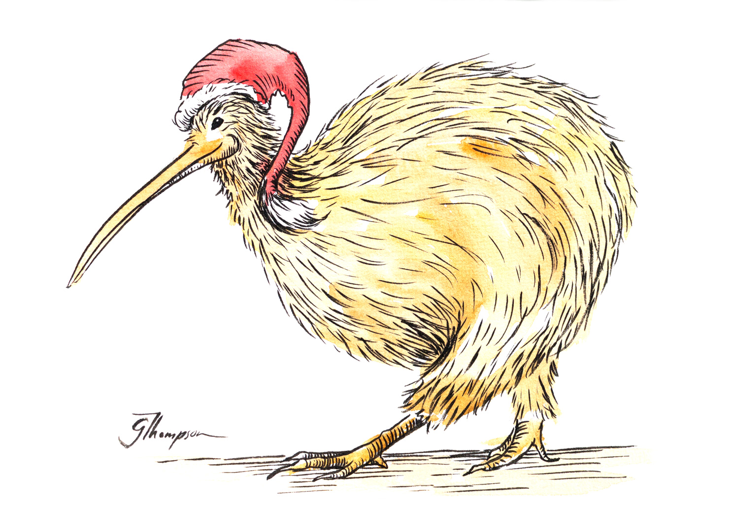
After the success of my Christmas card range that I launched at the end of 2019, I decided to create a range that could be used for any occasion. This time I wanted the birds to have a bit of fun and show a side of their personality.
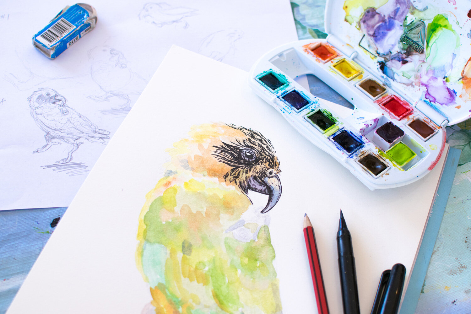
There was a fair amount of planning that went into each bird image before committing colour to the page. Above you can see my sketches to the left before starting the final work.

Not all works go to plan. Above was my first attempt at the Piwakawaka card - making a visual pun of ‘fantail’ with a fantail sitting on the end of a fan’s electrical cord. I decided my visual pun was a little obscure and tried again with another idea later.

The first completed artwork was ‘Kiwi Eats Kiwi’. Completed in Jan 2020. I was on holiday and feeling relaxed. The drawing came easily and was as striking as I had hoped.

Finished ‘Kiwi Eats Kiwi’ artwork.

Pre-covid days in Jan 2020. I was carefree.

In the studio creating new sketches during March 2020.
During New Zealand’s first lockdown in March 2020 I hit a creative block. I decided to draw what came to me at the time to help get me out of that block. I drew Kiwi’s in bubbles as we were all in our household bubbles at the time. Each kiwi was drawn to different actives such as eating, yoga, and tea drinking.

Lockdown Kiwi bubbles.

Final Kaka drawing “Take me to Kaka Point”. A Kaka hitching a ride to his favourite surf spot.
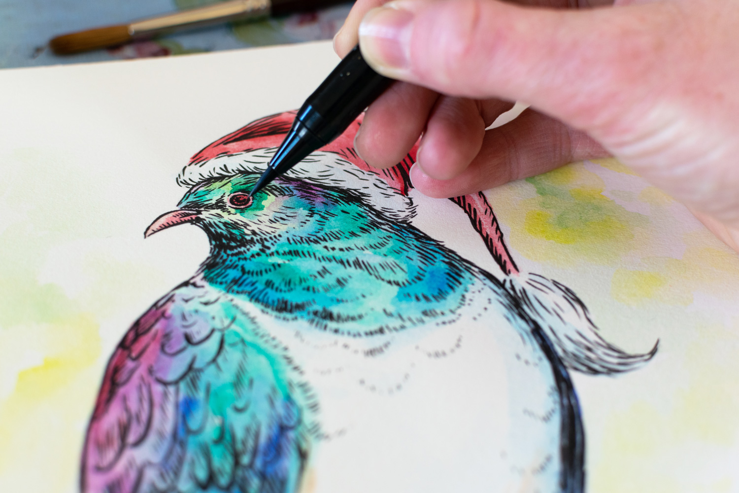
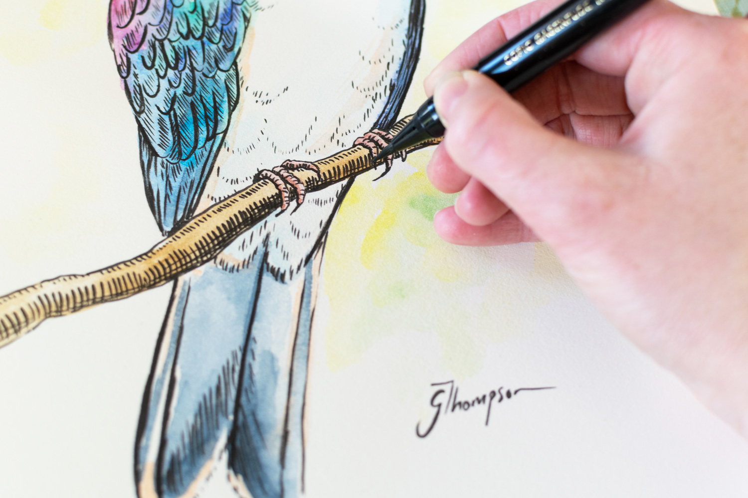
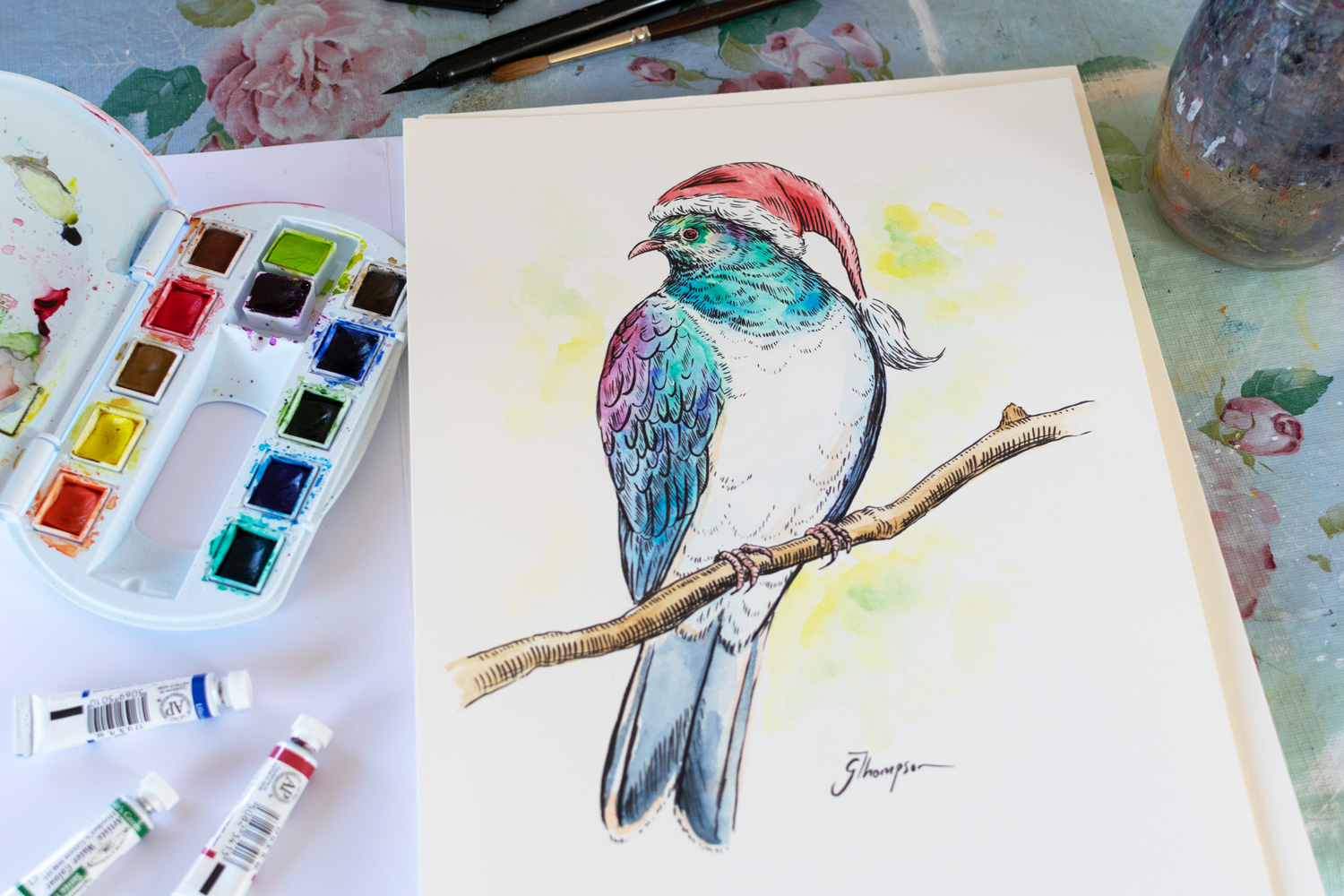
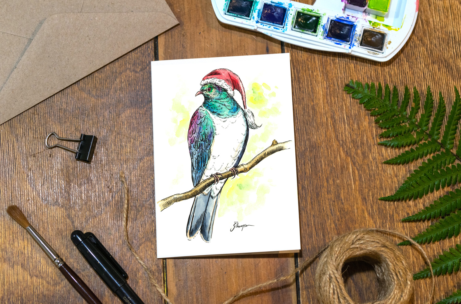
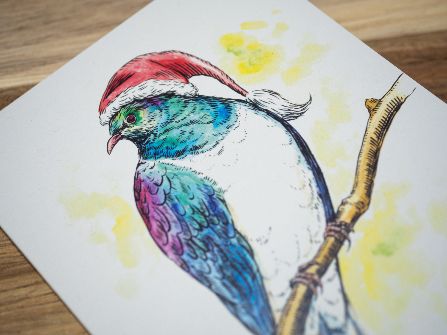
Final Kereru drawing “Heavy-Ru”, this guy had a few to many berries and the branch is struggling.

Final ‘Lockdown Kiwis’ drawing.

Final “Kiwi Eats Kiwi” drawing. Still one of my favourites from this series.

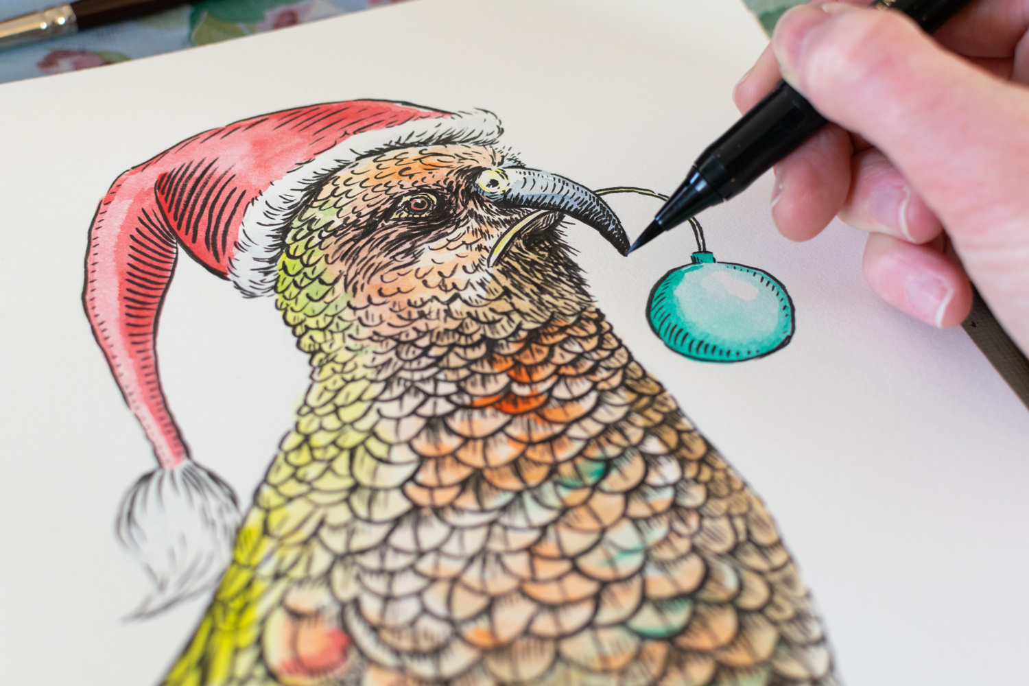
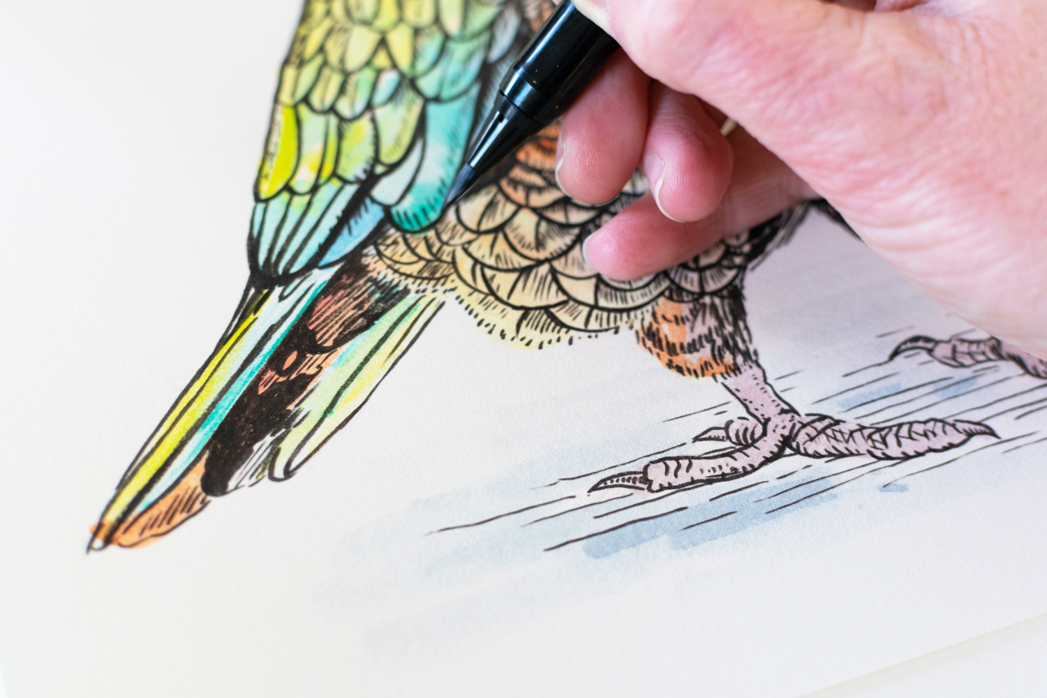
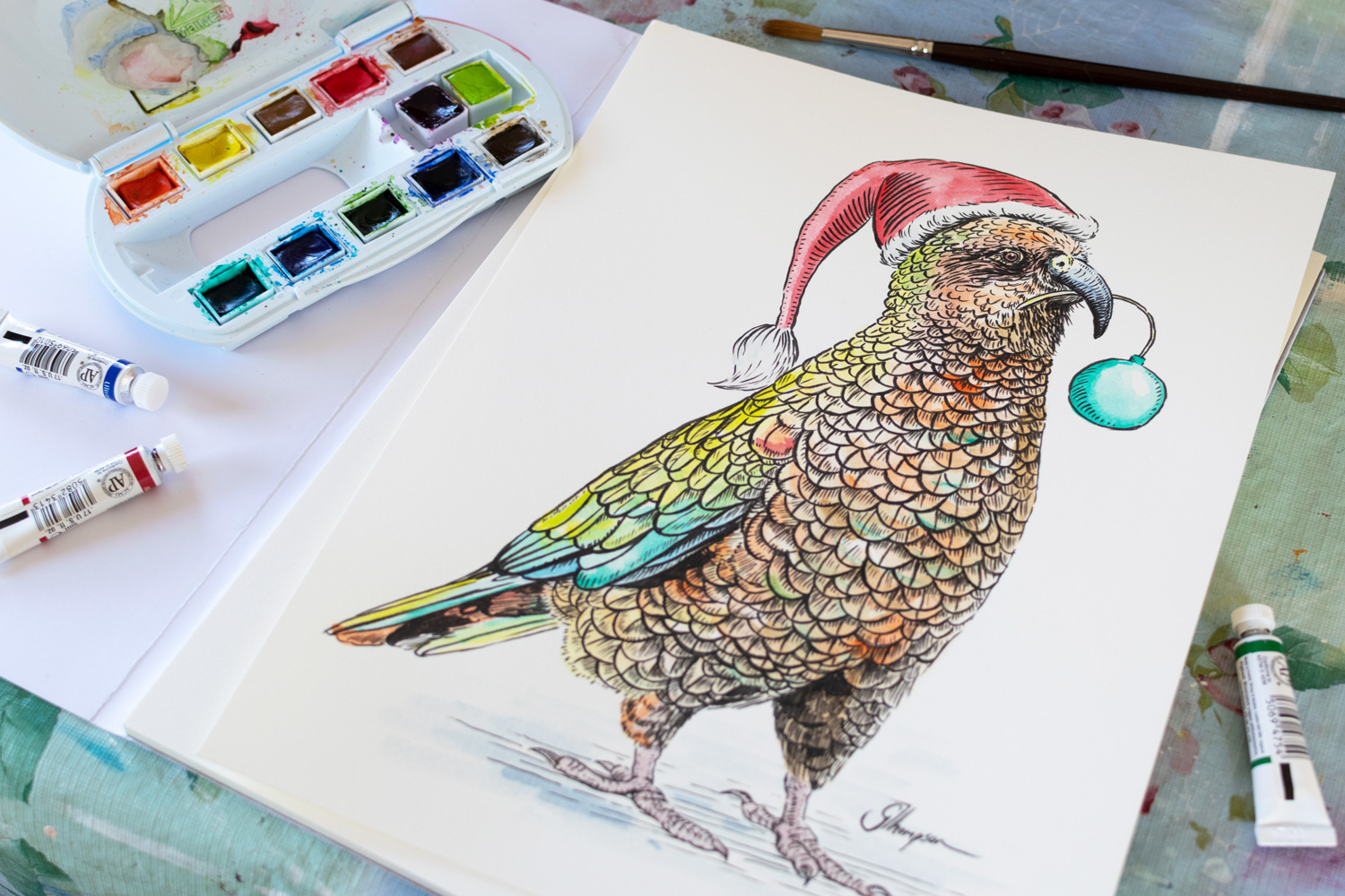
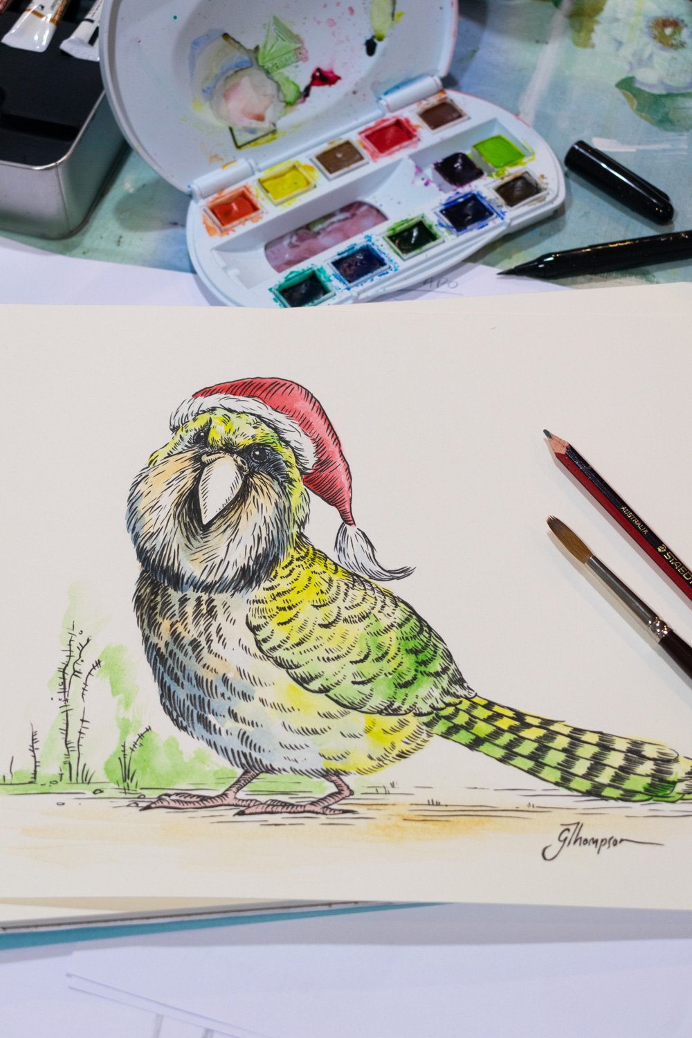
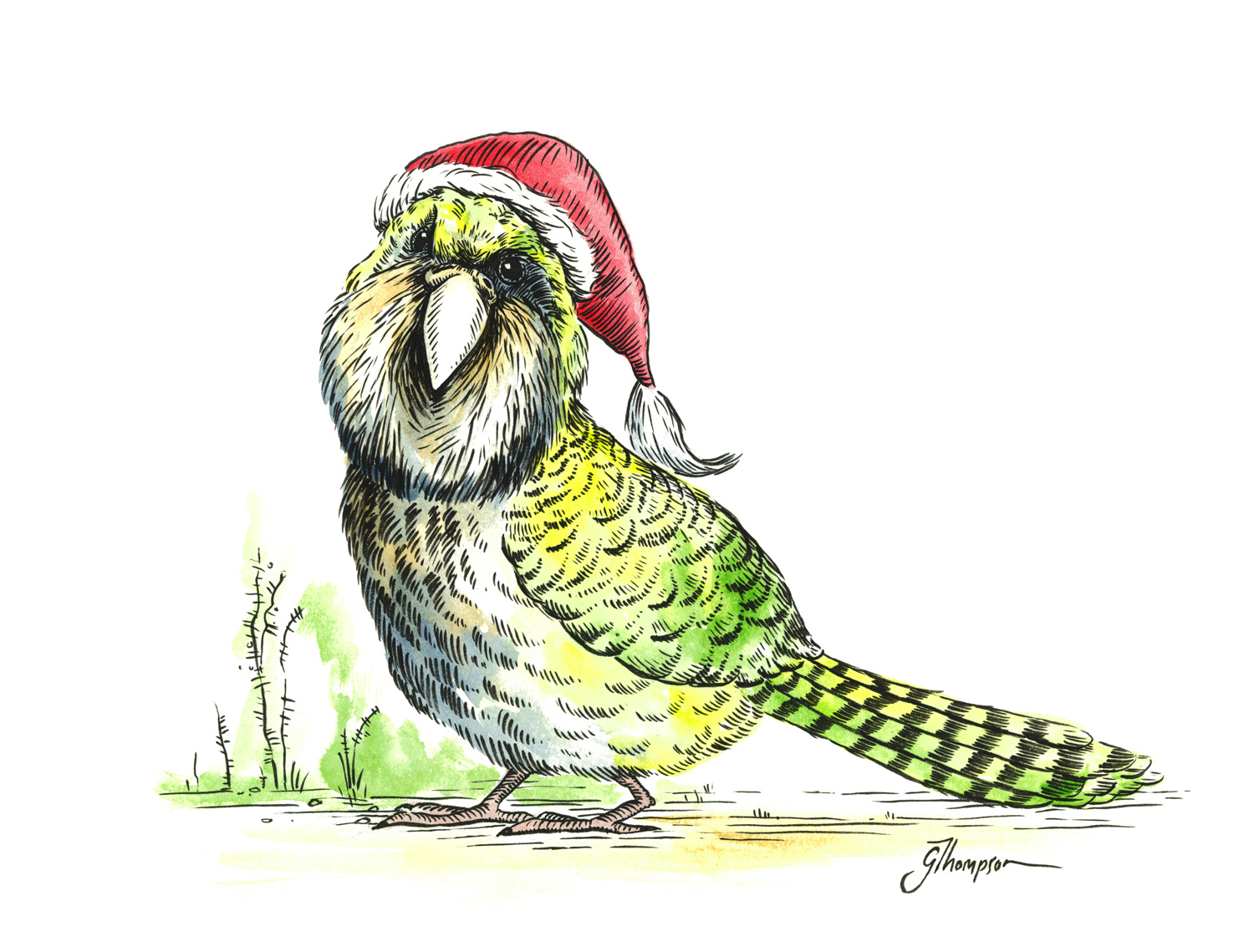
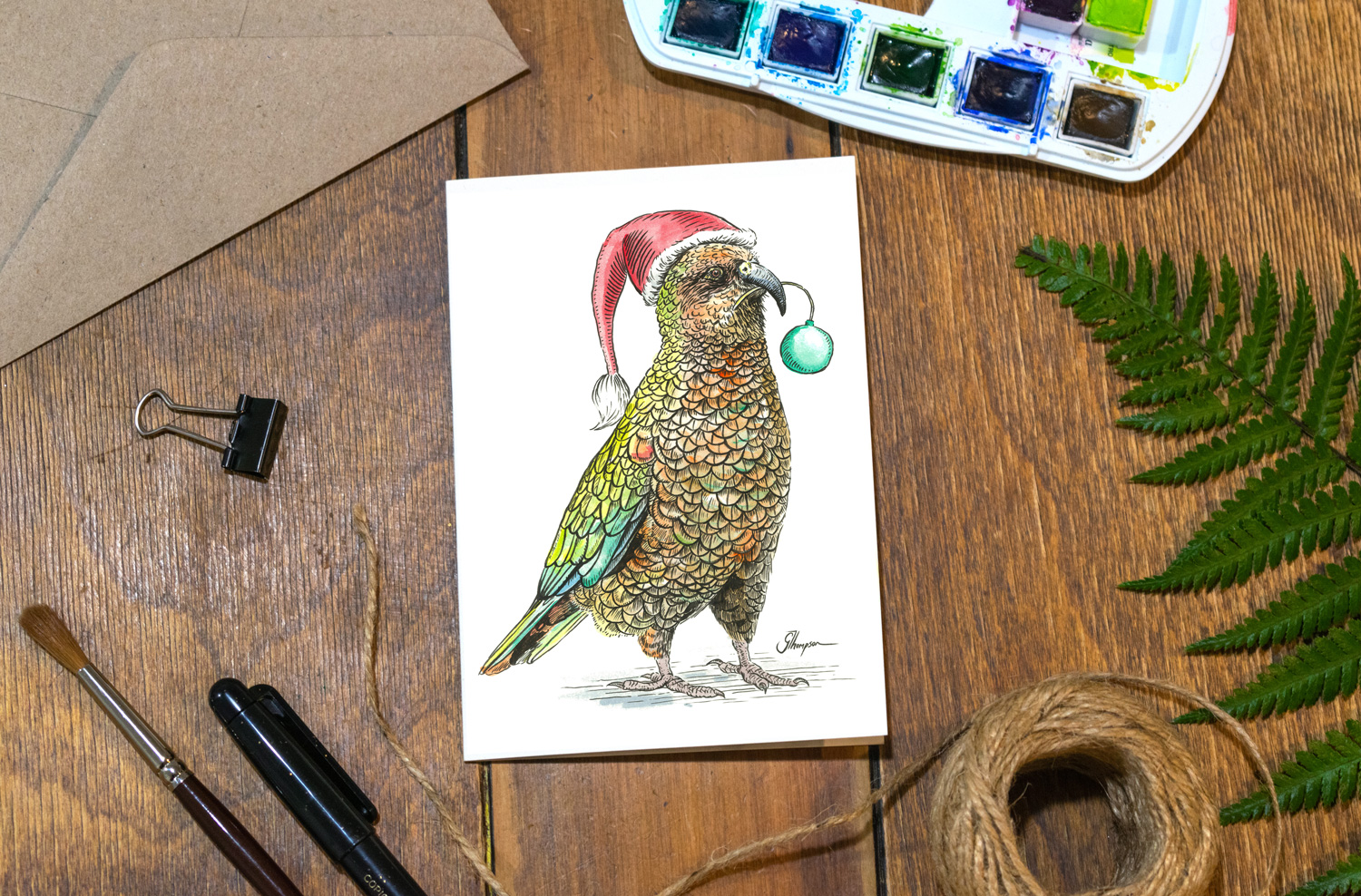
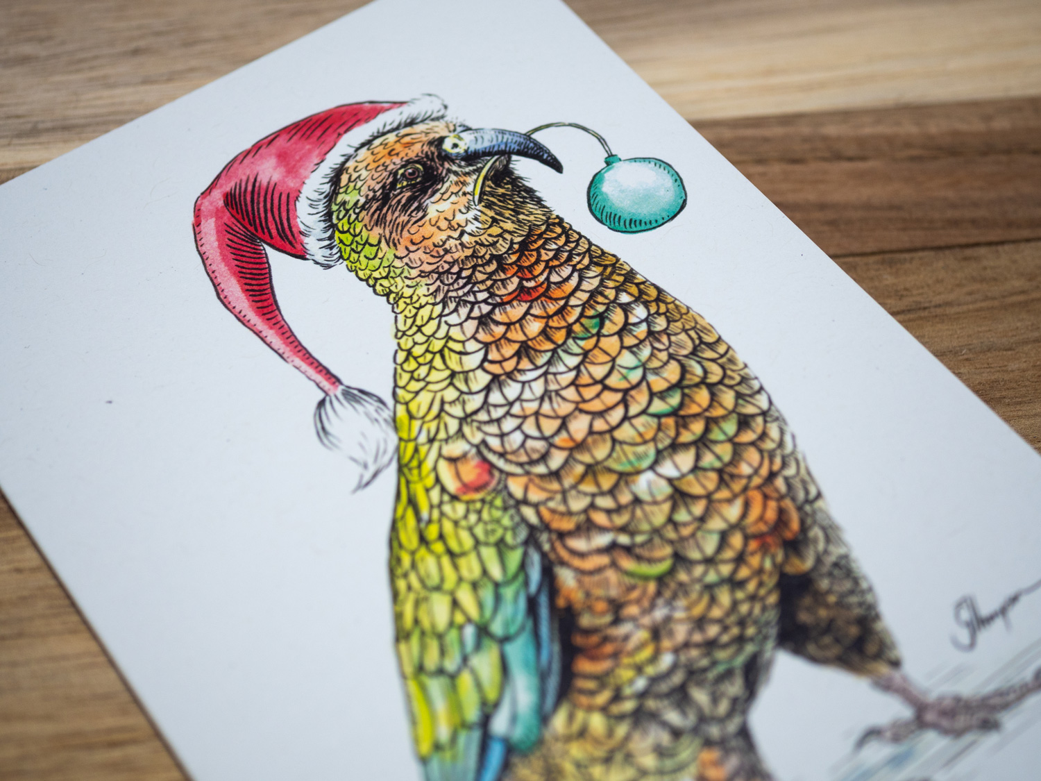
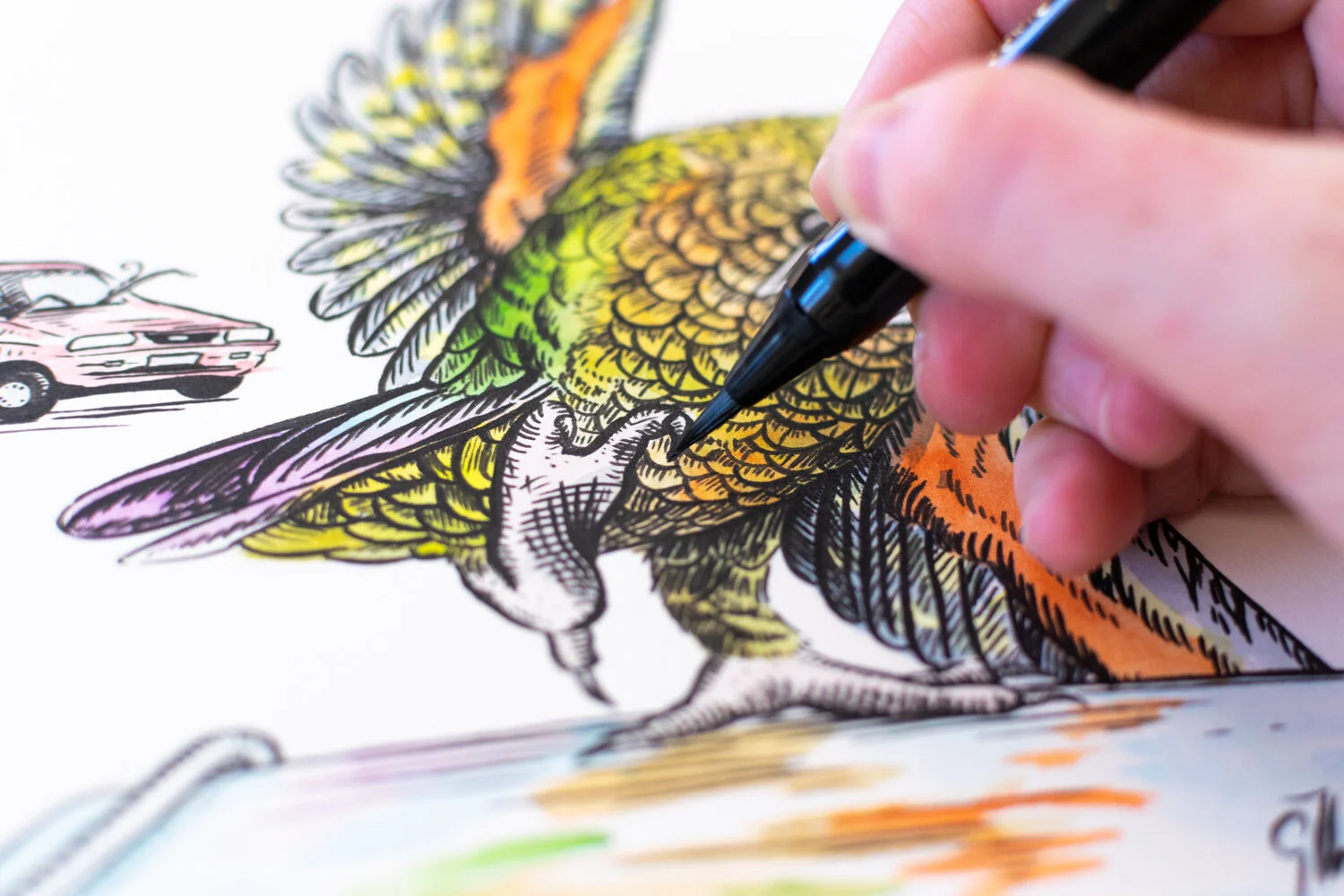
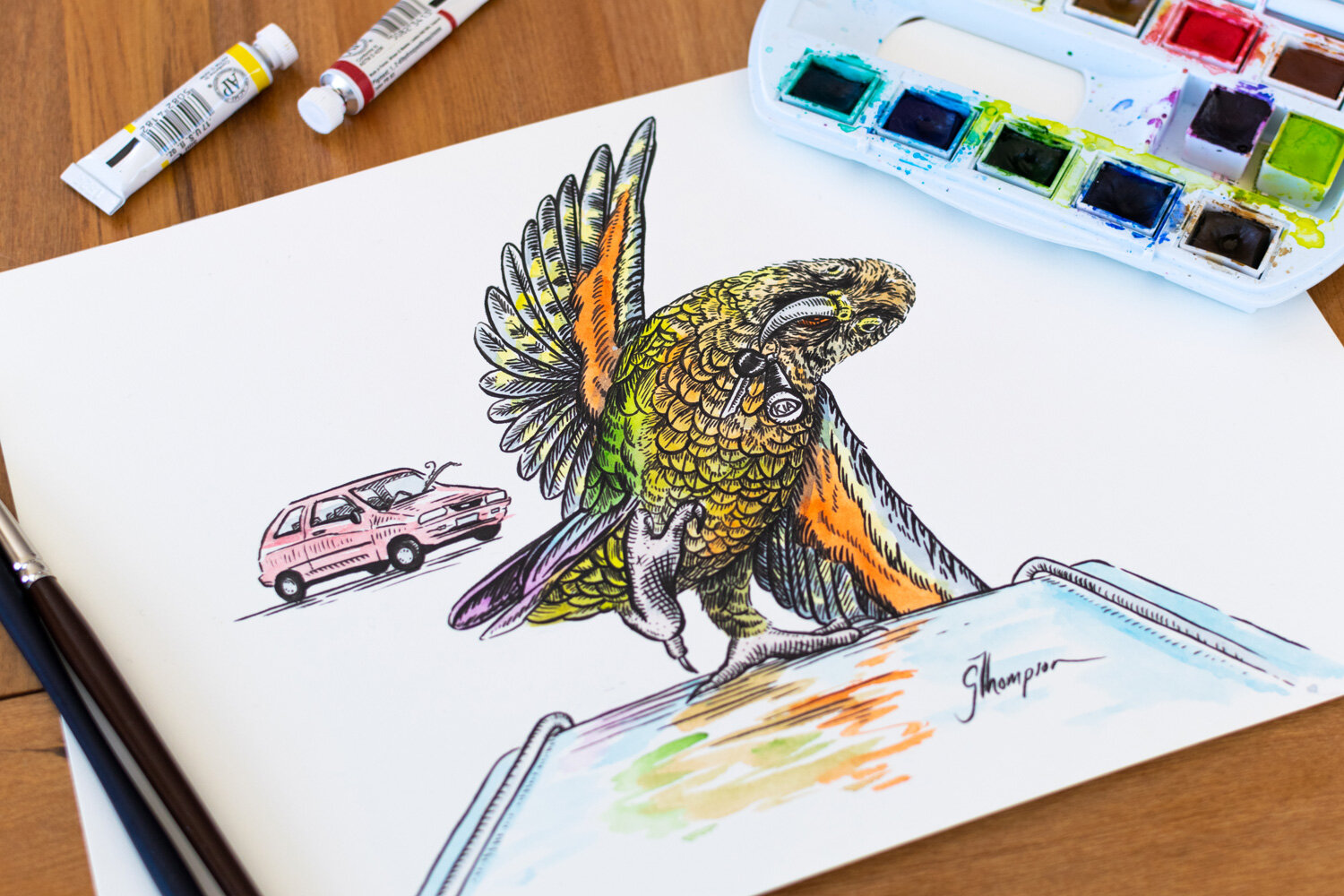
Final Kea drawing “Where’s the Keys?”. This cheeky wee fella has stolen the keys to a Kia car!

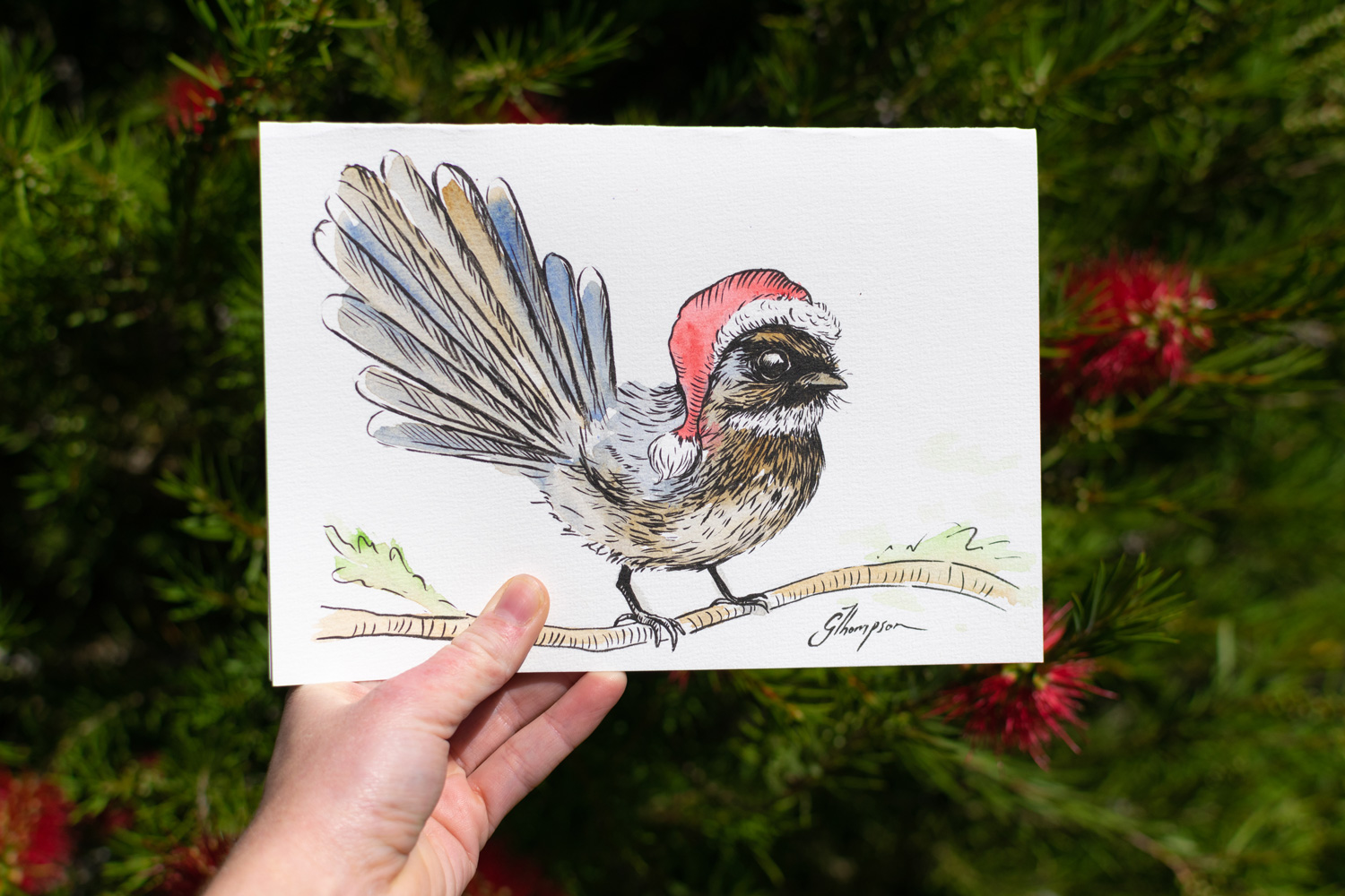
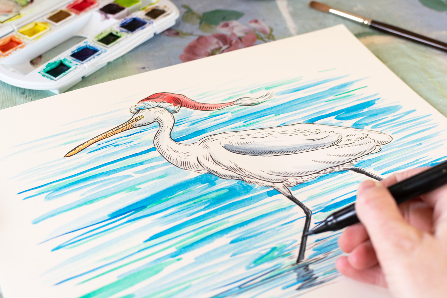
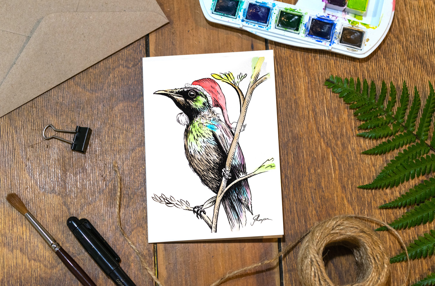
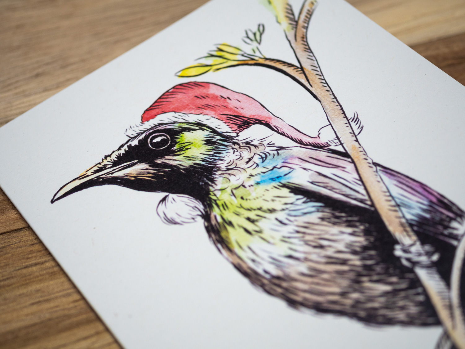
Final details of this Tui drawing.

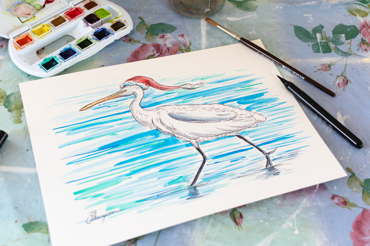
Final Tui drawing “Yea Right” . Let’s be honest a Tui wearing a hat - yea right!

Final touches to this Hoiho. Look at that happy face!

Final Hoiho drawing “Surfs Up Hoiho”. Gosh he looks like he’s having fun! Wish I could surf that good.

Finishing touches to this gorgeous Piwakawaka.

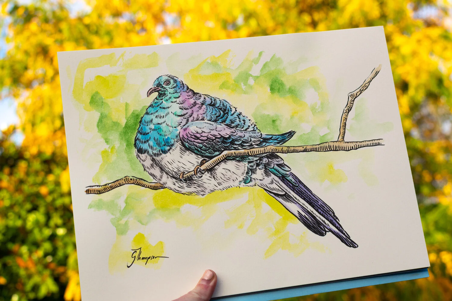
When I thought of this idea it just has to be done! A Piwakawaka on a waka - oh yes! For those not familiar with Te Reo, ‘Piwakawaka’ is the māori word for Fantail and ‘waka’ is the māori word for ‘boat’.

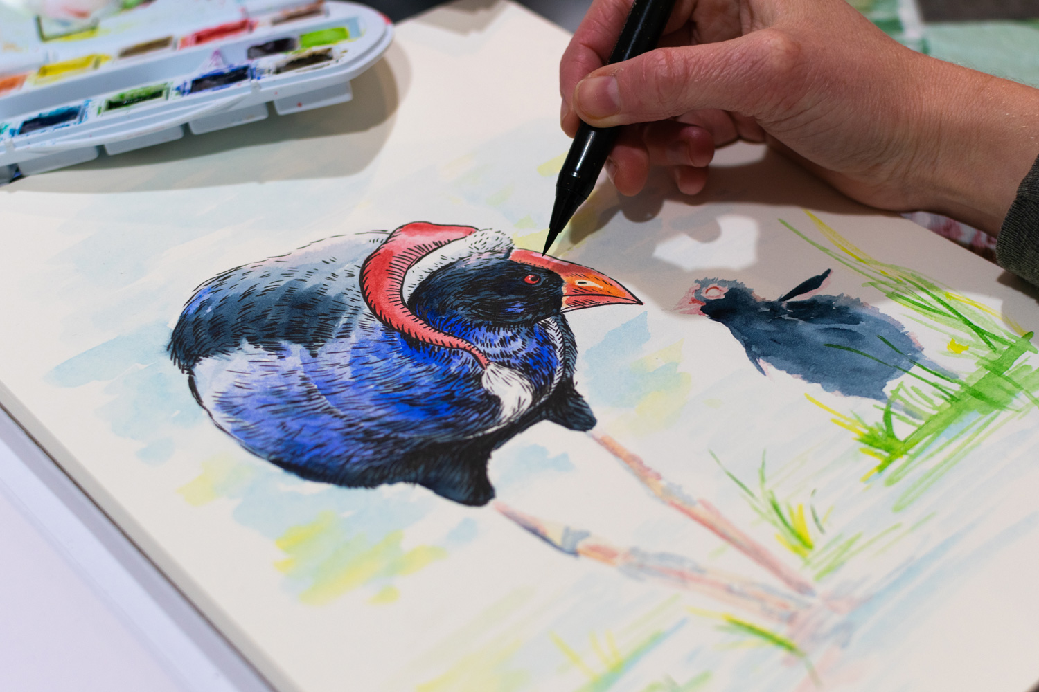
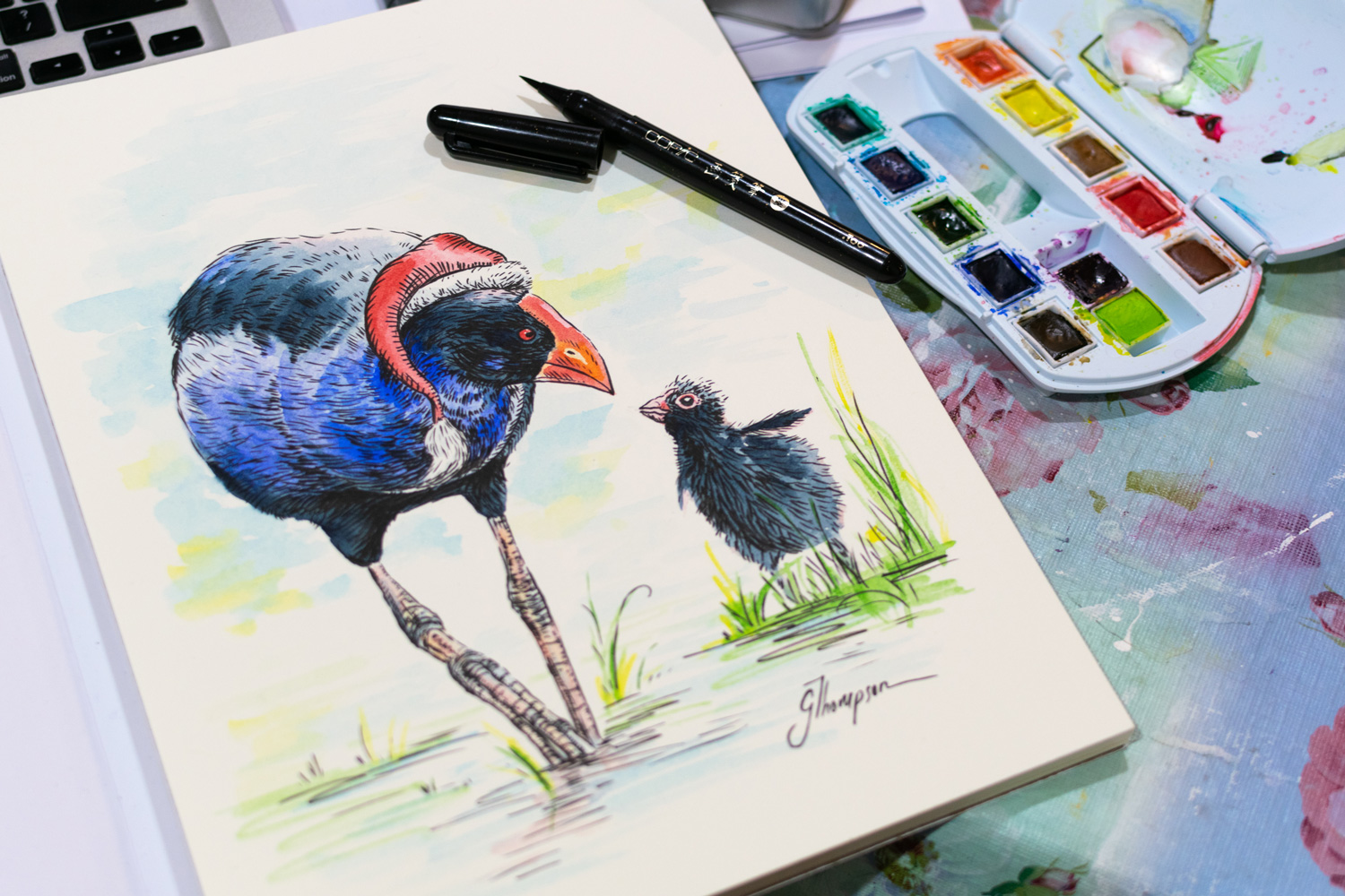
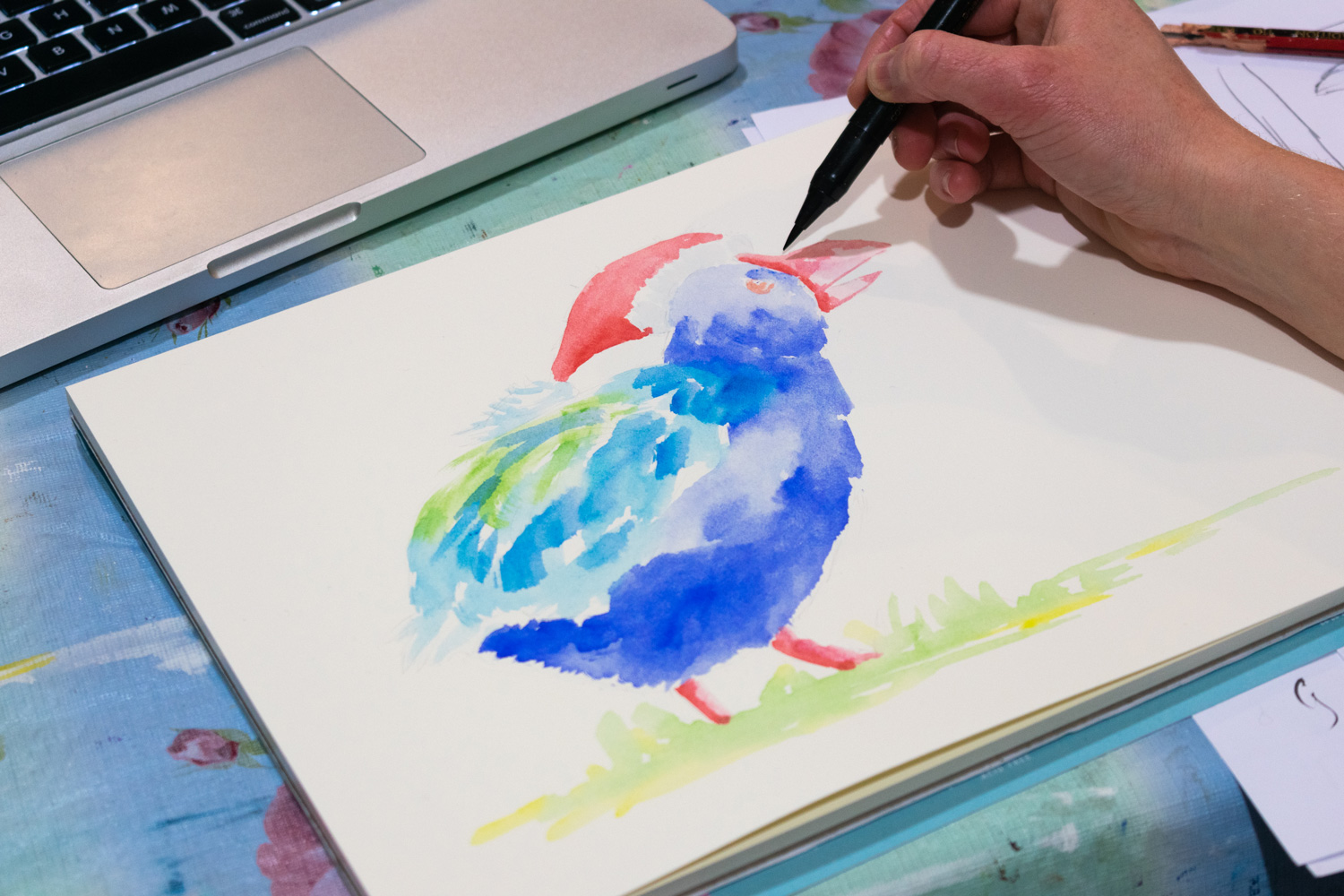
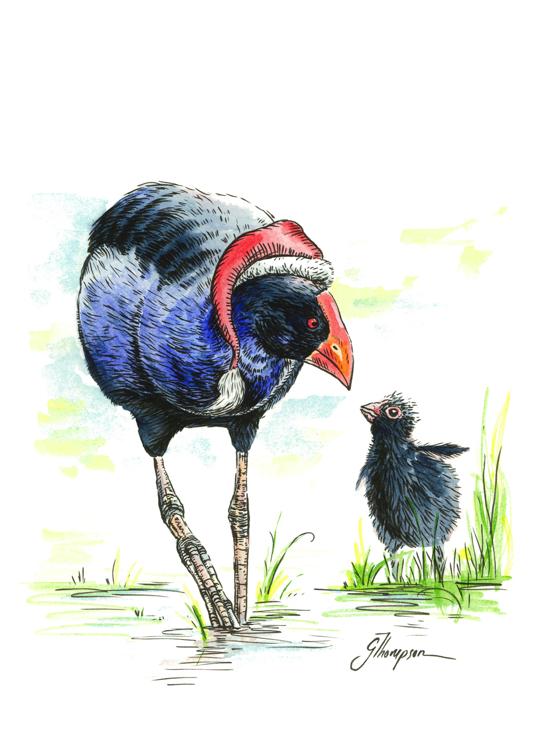
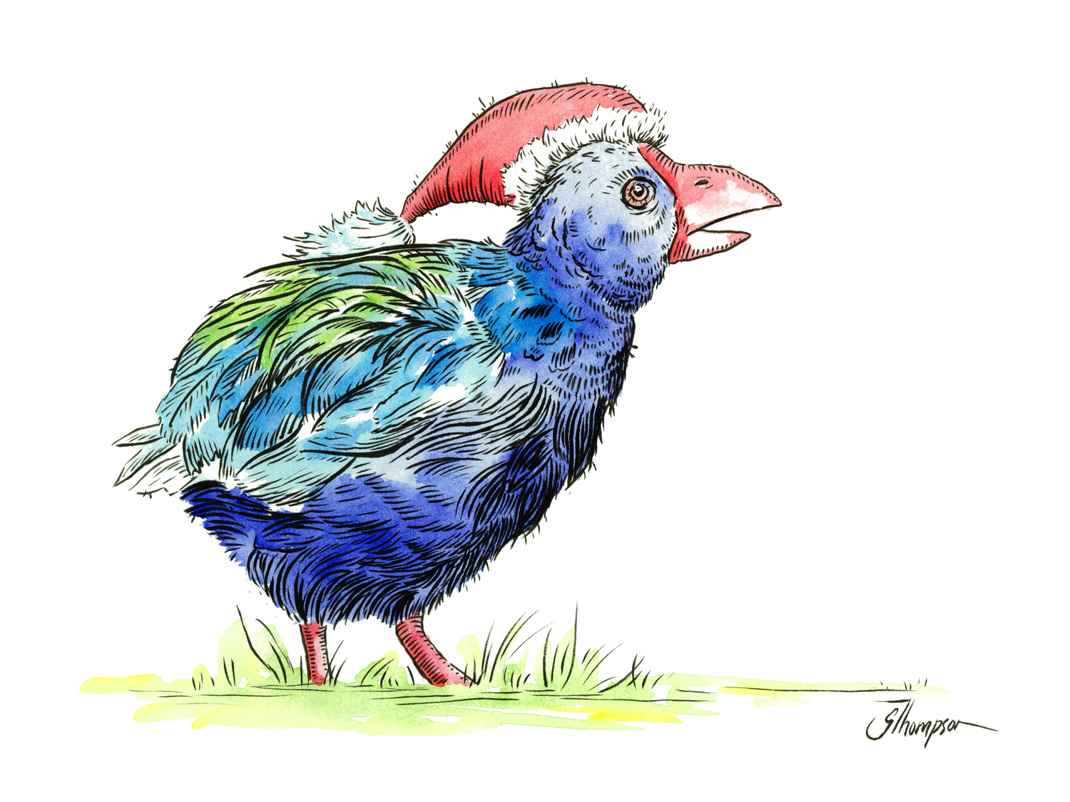
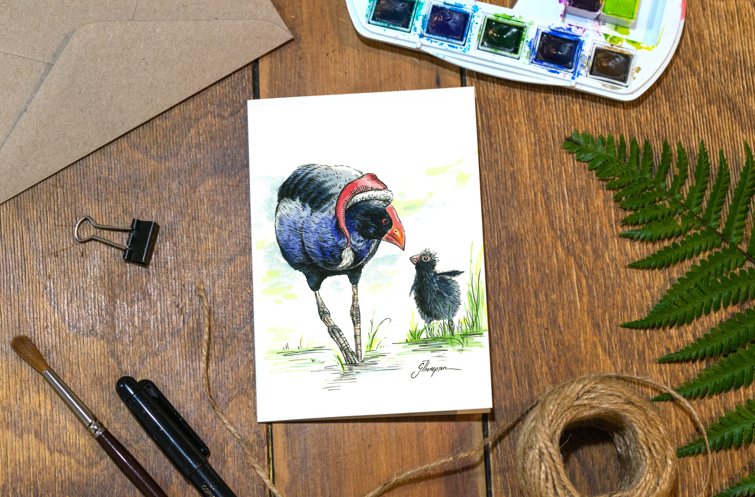
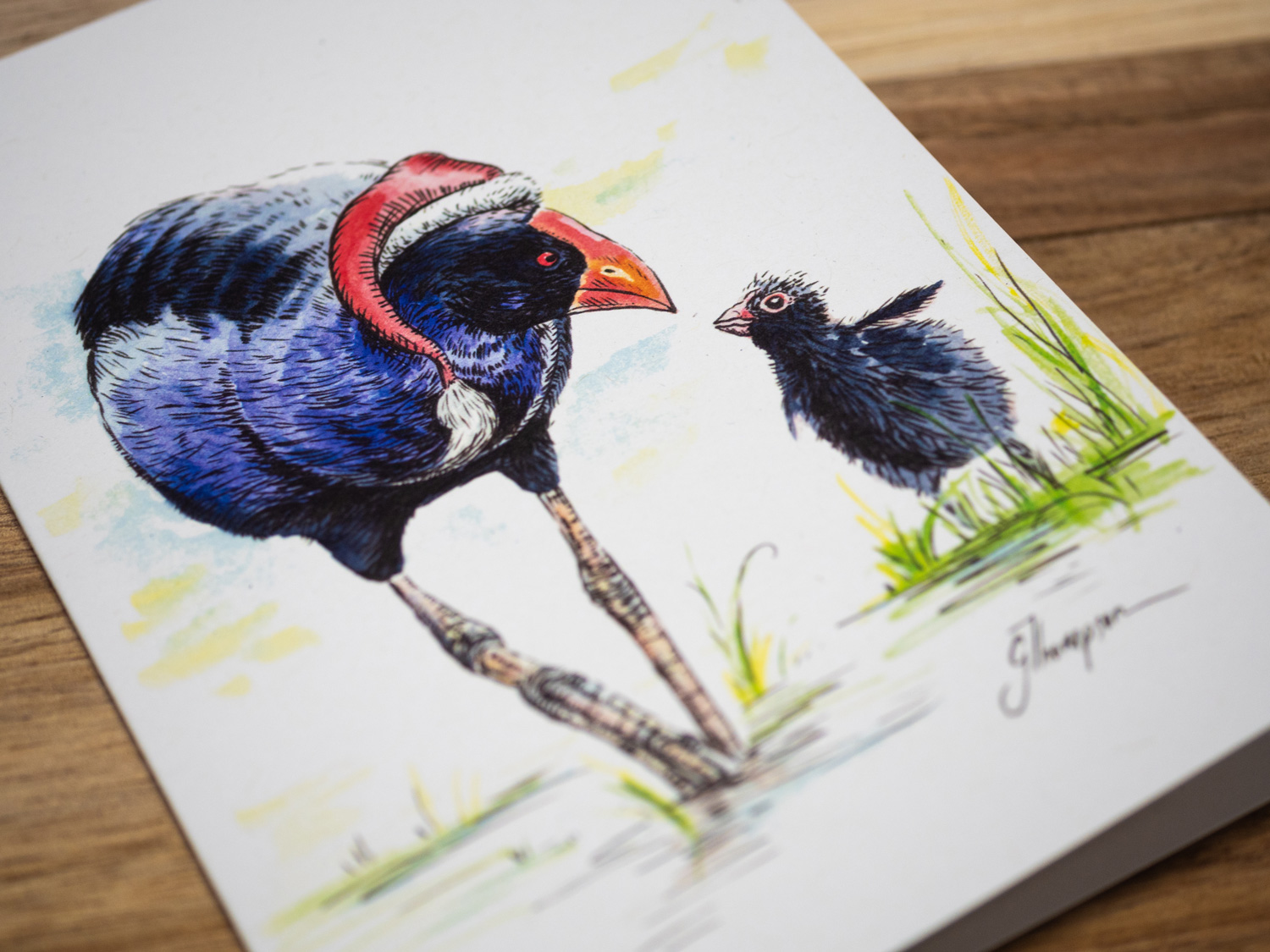
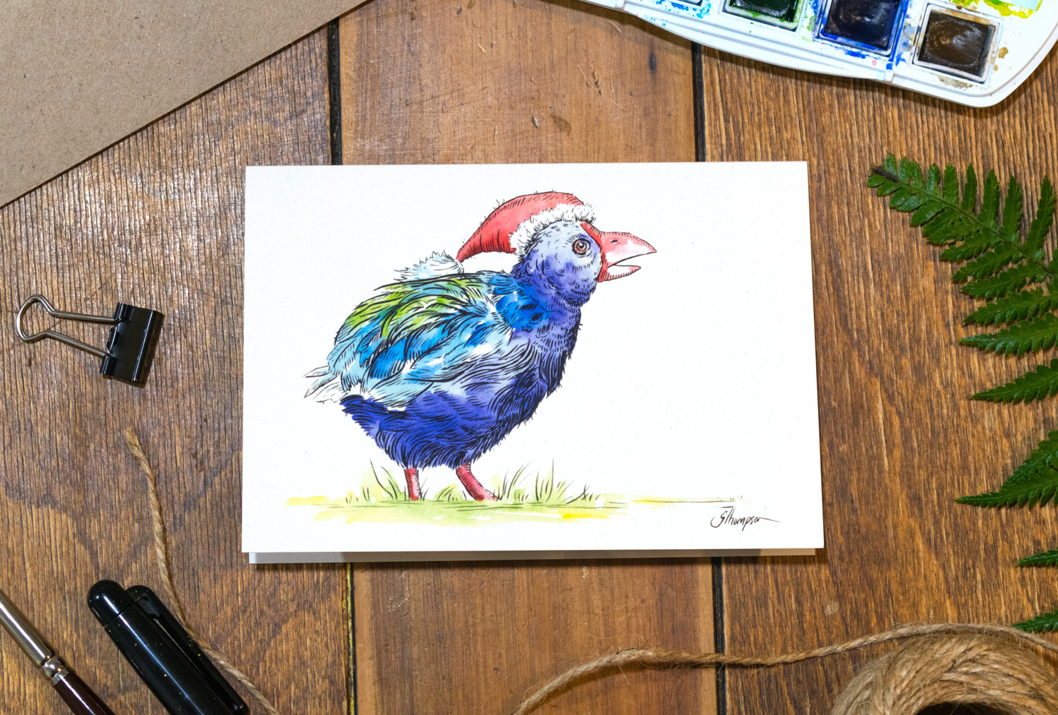
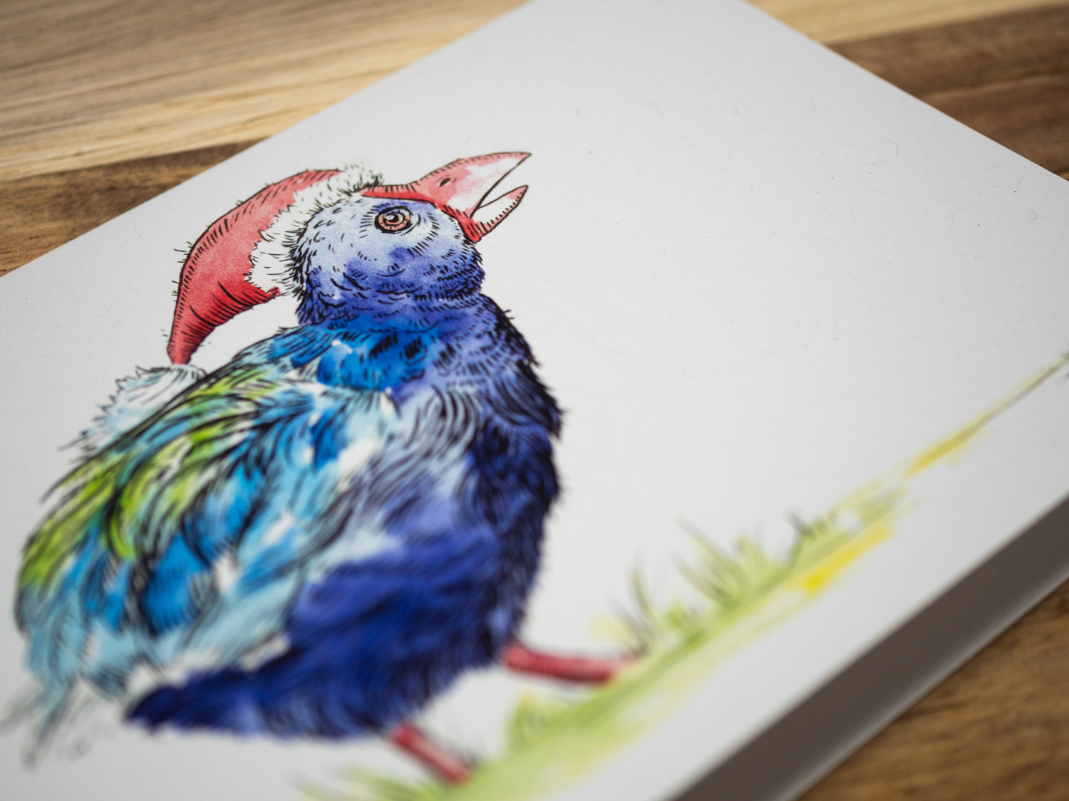
Detail of this gorgeous baby Pukeko.

I have always thought the way that a Pukeko walks is a bit like it is balancing a tightrope. What better tightrope than the good old number 8 wire on a fence somewhere around New Zealand. “Walking the Number 8 wire”.
Second attempt of the Kea drawing.
Sometimes I try creating another sketch to see if I can improve on my first attempt. Even though I liked this new sketch, I didn’t think that it would work well on the shape of a greeting card. So this sketch was not included in my final set.

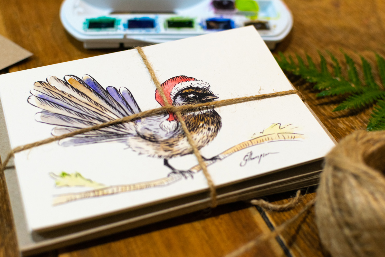
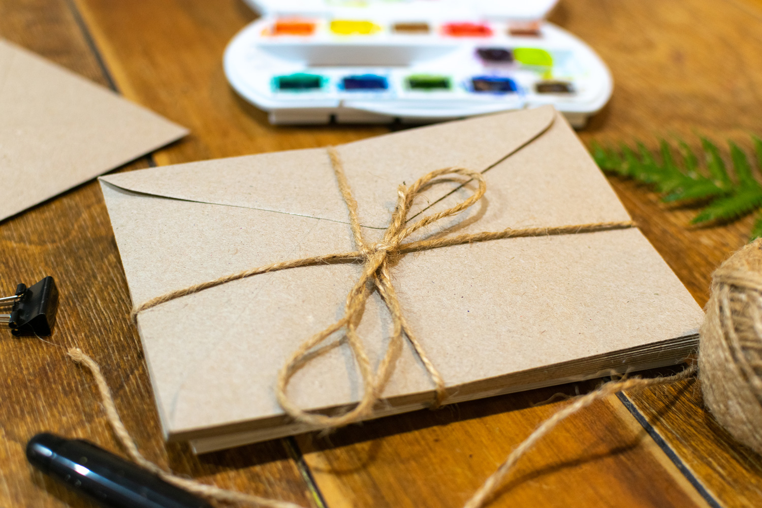
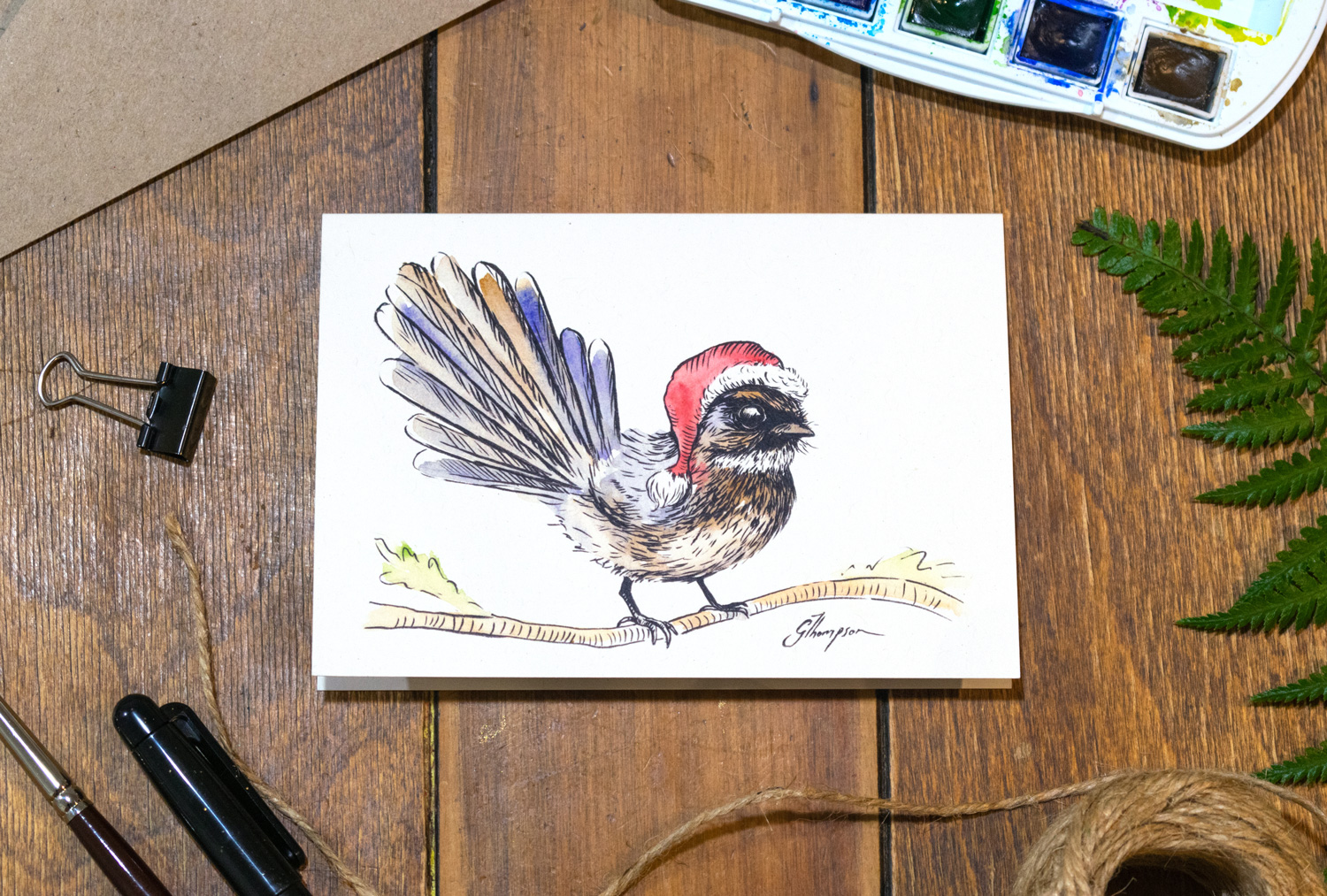
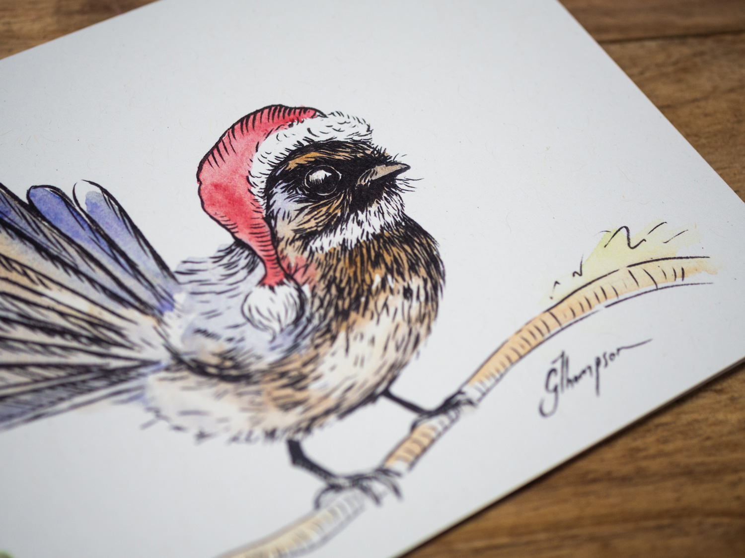
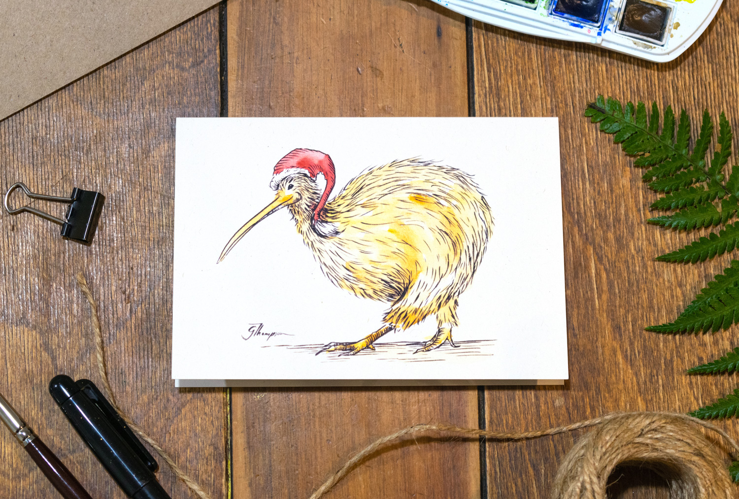
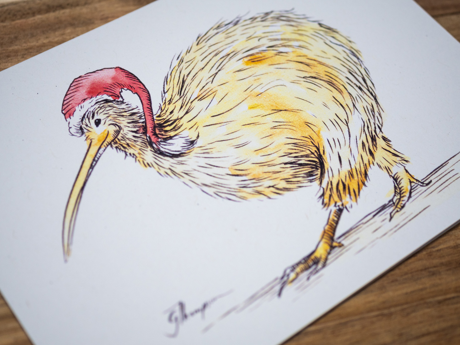
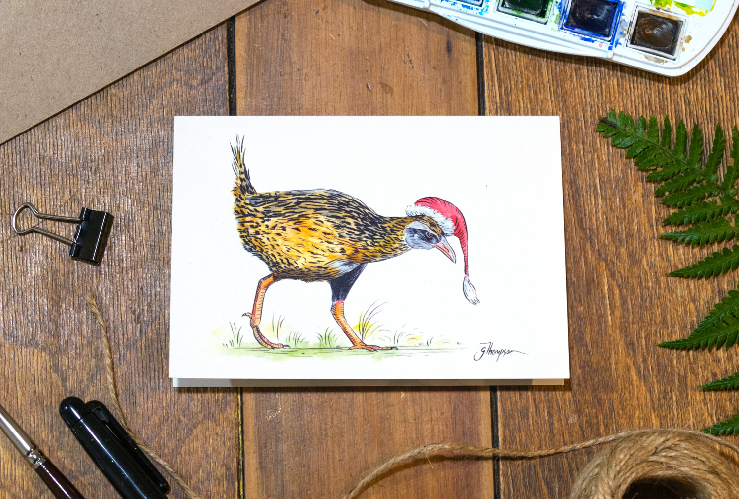
Promo image I took to help promote the greeting card range.

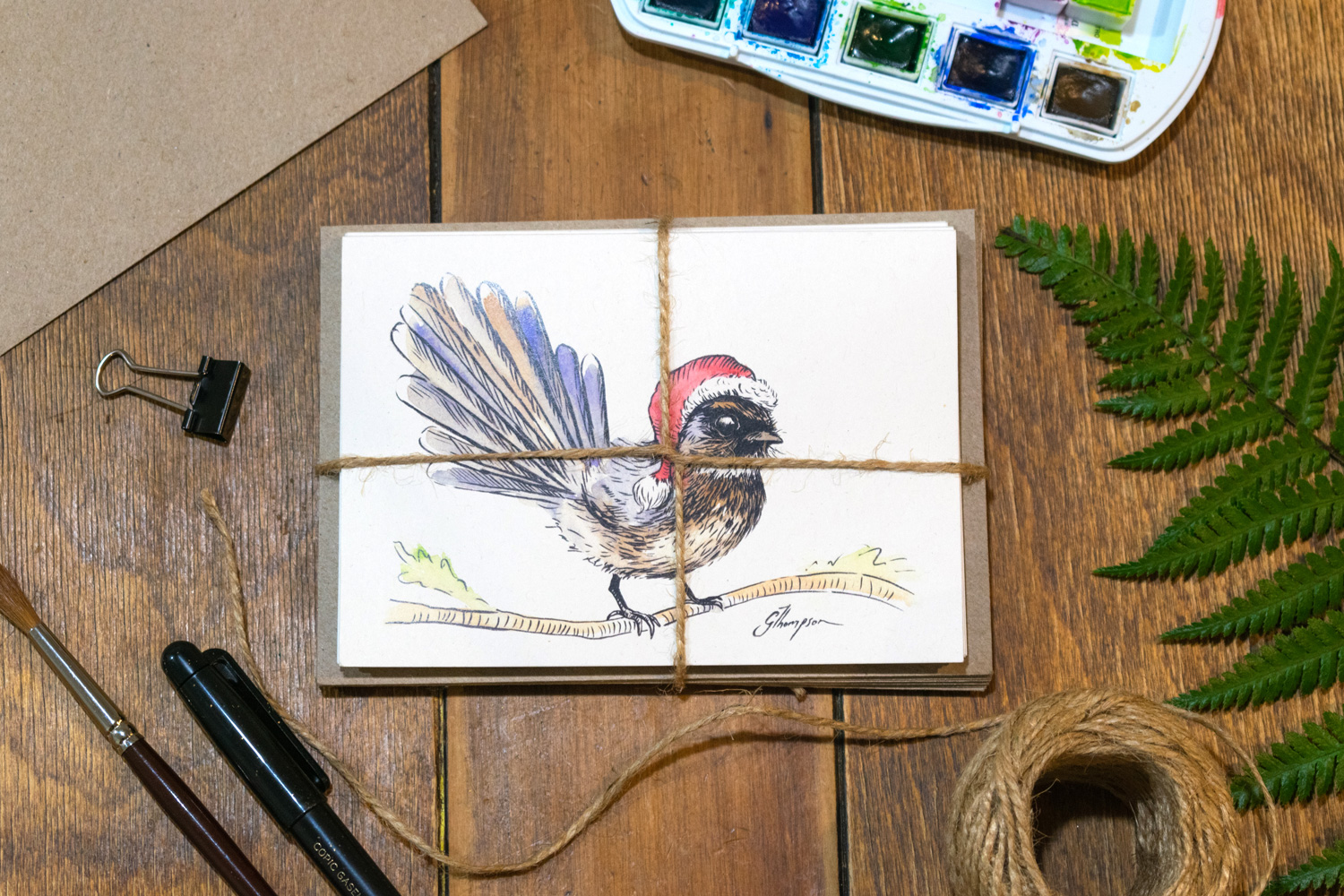
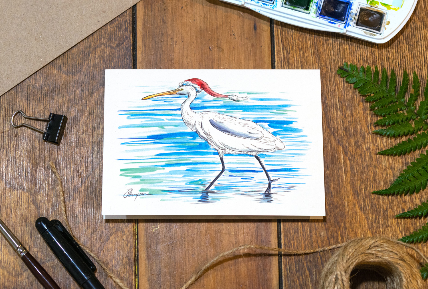
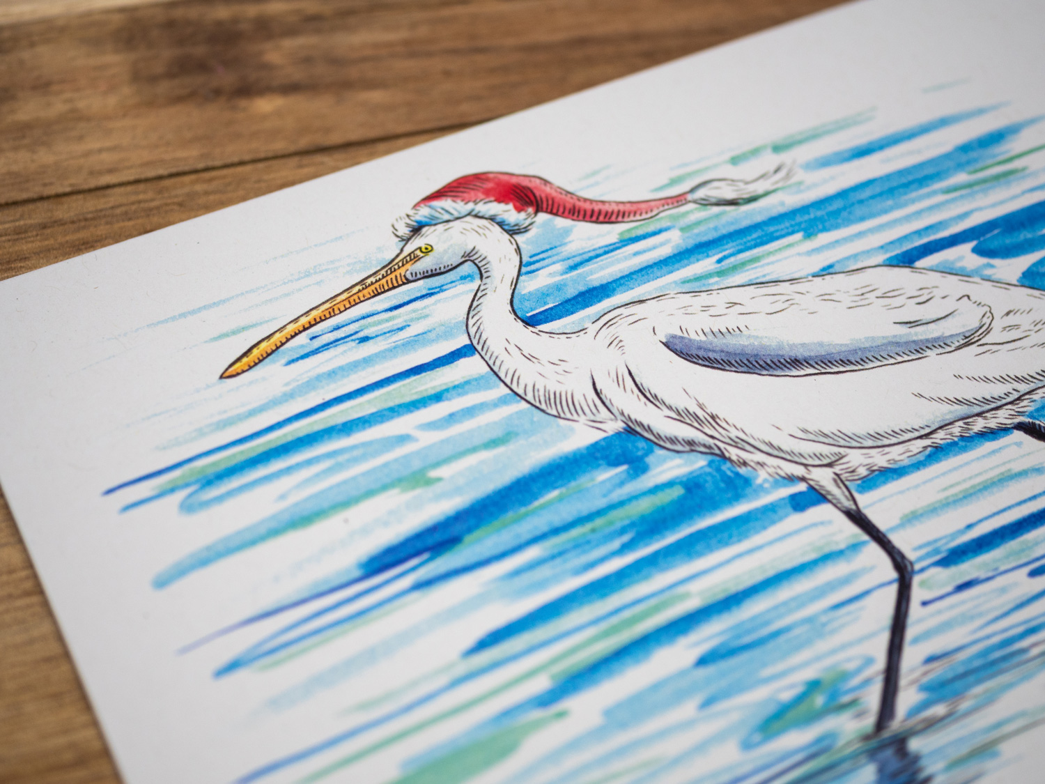
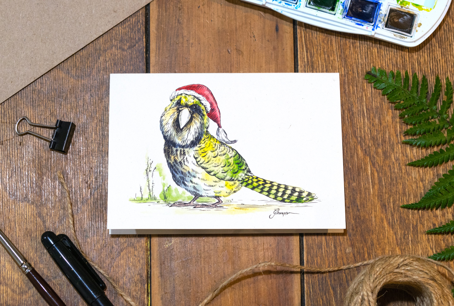
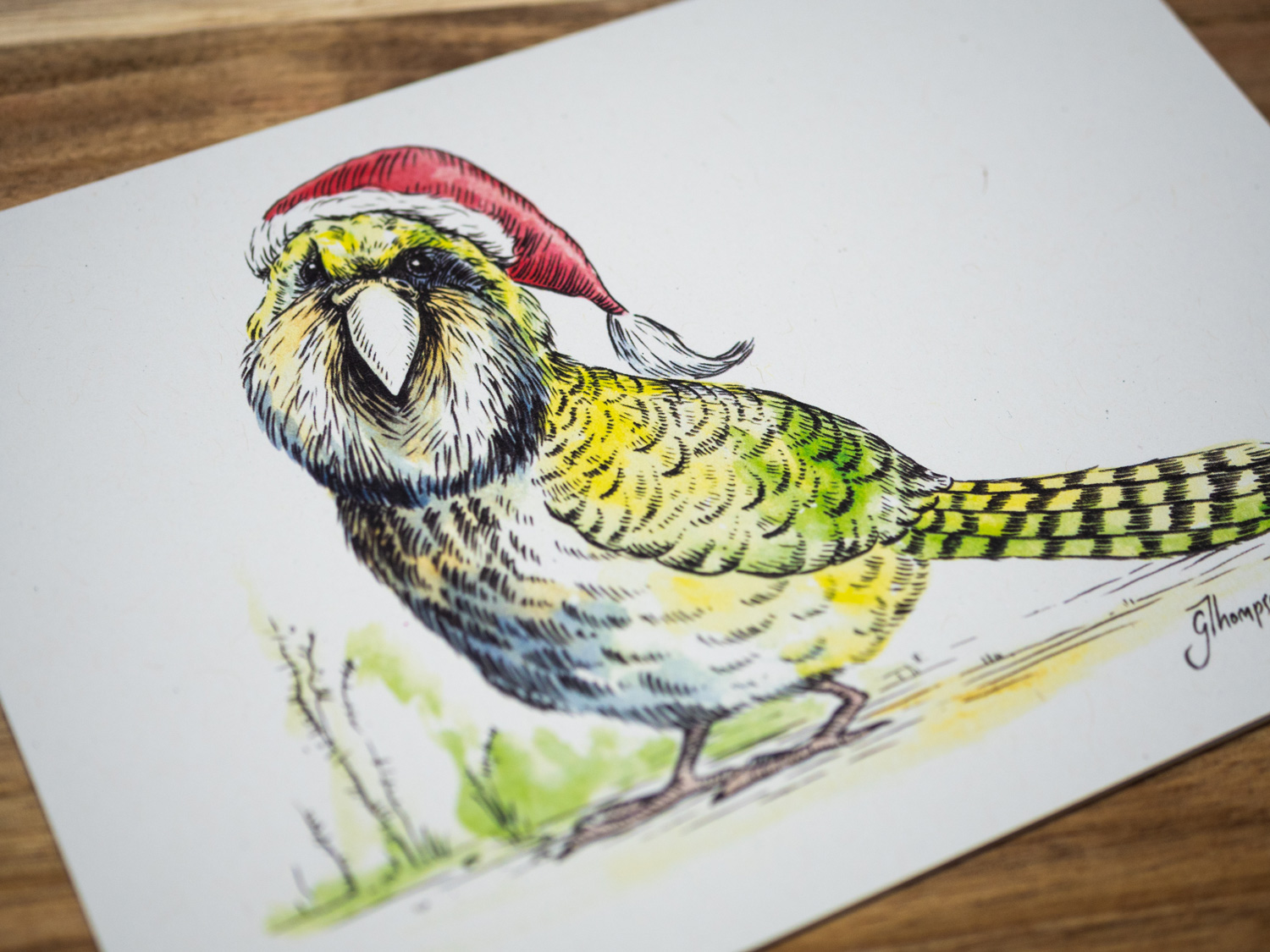
The natural props around the cards align well with the recycled paper used in the production of the card and envelope.
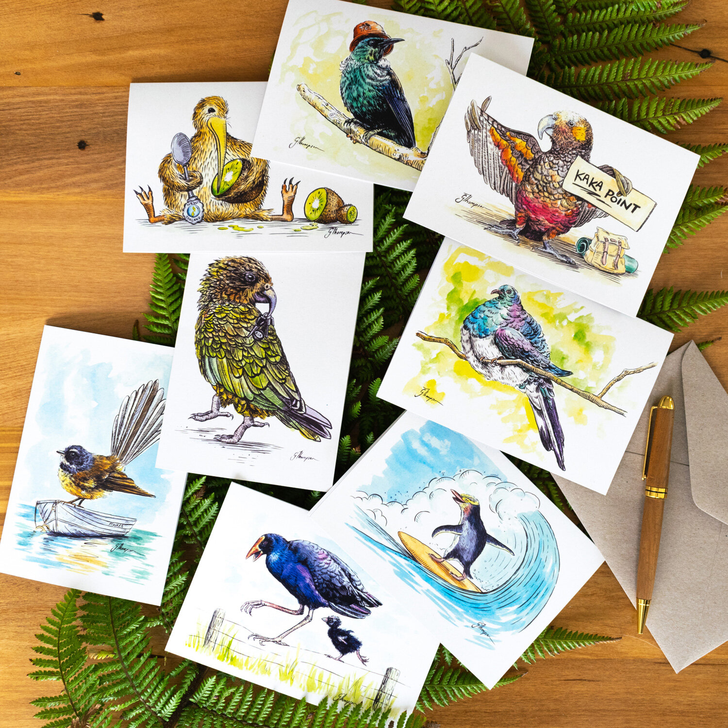
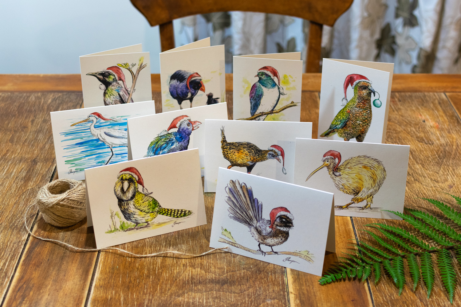
All 8 card designs.
The complete set of multi-purpose greeting cards all together. I am super proud of this set.